Icepop
A playful gourmet popsicle storefront that turns product discovery into an expressive brand experience.
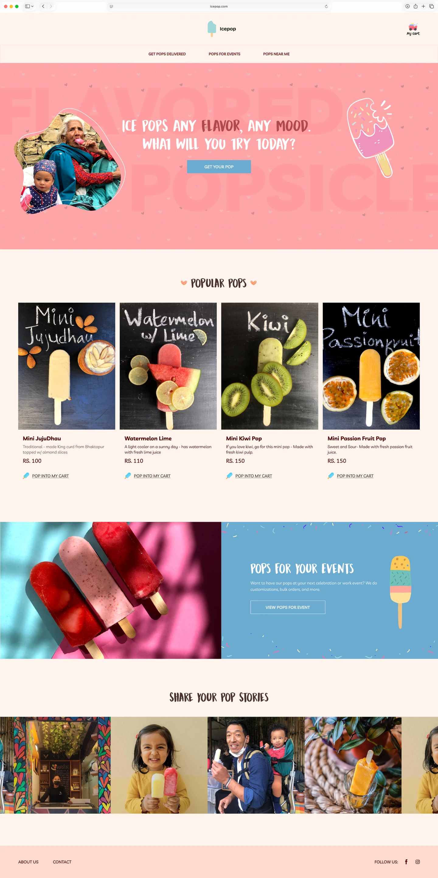
Project overview
Icepop is a direct-to-consumer e-commerce storefront for a boutique gourmet popsicle brand. Its visual direction uses whimsical typography, organic shapes, and a warm palette to give the product a distinct personality.
The design challenge
A small consumer brand needs to communicate character and make its products easy to explore. Expressive visual design has to work alongside a shopping journey that remains clear.
Inside the experience
Lead with product personality
Large product imagery and playful typography establish an identity before the visitor begins evaluating individual products.
Use shape and color as a visual language
Organic forms and a warm palette create a consistent tone across the landing page instead of relying on a generic storefront layout.
Connect storytelling to shopping
The page presents the brand through a product-led storefront. Its intended role is to move people from curiosity toward product exploration.
Design rationale
The design treats brand expression as part of product discovery. Visual character can invite exploration, while clear information and calls to action still need to carry the shopping task.
What to validate next
Evaluate product findability, mobile readability, and the path from product interest to purchase. Conversion improvement is a goal, not a measured outcome in this presentation.